Sunday, January 29, 2006

photoshop masquerade

Or, how to use masks to highlight just what you want in a picture. I learned this from Evan Hollander's great tutorial about how to get a good bead picture, and have it floating above a blurred hint of a background. But my first application was to a photo of me wearing my new leaf pendant.

First, catch your rabbit -- that is, get a decent digital pic to play with. Here is a photo of me on the deck outside Isabel's window, with the back woods, in all their drought-given brownness, and the playhouse behind me. Crop the photo at some time during the process to just the area you want. It doesn't matter when you do this, but if it's a big picture and you do it first, other processes will be a bit speedier.

In the LAYERS menu, make a duplicate layer. This will show in the layers list as a duplicate of the background layer, above it in the list. This is the layer you work in; you leave the original layer alone.

In the FILTERS menu, choose Blur, and then Gaussian Blur. Use the slider to make it more or less blurry.

Then go back to the LAYERS menu and choose Add Layer Mask, selecting Reveal All.

Then comes the magic part. You choose black as the foreground color, and get a big soft-edged brush, and PAINT over everywhere that you want to see through the blurry mask layer to the original photo below. In this instance, I used a normal paintbrush to reveal my face and front and the pendant. Then I used the options panel for the brush to choose Dissolve, not that I had any idea what would happen, and with a brush with only 12% opacity and the Dissolve characteristic, I painted over the rest, and got all those little sort of sunflecks. Finally you merge layers, and lower the image size if you want, and it's done.

I can't wait to try this with a closeup of a jewelry piece, and to explore all those other options - other filters, other brushes -- WHEE!

Friday, January 27, 2006

finished leaf pendant

Well, almost finished. I realized after I took the photos that I still need to trim the ends of the silver wrap wires. But that should be a tiny detail.


The previous post shows my Beadscape plans for this bit of peyote work, 930 beads, the first solid piece of peyote I've done in a long time, I guess over a year. It was quite slow because my eyes and glasses are so poor. Kept switching between without glasses, where I could see the work fine but at 3" distance, and with glasses so I could pick up more beads without having to curl down over the dish.

To the right is a good view of the beadwork with the light reflecting off the front. Complete backlighting gives a totally different feel to the piece, seen below.
Of course, when worn as a pendant, complete backlighting is unlikely. But I think the effect will be different depending on whether it's worn over a white or dark blouse.
If I can manage to trim the wires neatly enough to make it reversible, one might even prefer to wear it with what I think of as the back in the front (top right photo).

Anyway it's done, and I am pretty pleased with it.

Monday, January 23, 2006

leaf pendant, part 1

Partial report here, since I have the beadwork done for the core of the pendant, but I'm getting going on this week's Orient Express now, and I'll have to get back to this. What I'm showing here are reduced versions of my Beadscape renditions of the two-drop peyote pattern. First I had it planned for a black background. I changed my mind but didn't redo the pattern, and just winged it for a few rows with a light background and silver leafborder. Then I went and redid the pattern, changing the background and removing one of the inner shades of green, since I only had two silver-lined colors that went well together. Then at the last possible moment to change before I would have had to take out rows of beads, I realized how peculiar the crook in the midvein was where the petiole joins the leaf. I redid the pattern. One green bead is left where it should perhaps have been silver, but I left it rather than taking out two rows.

The beaded leaf is now complete, since Saturday evening. Tuesday evening was when I first started playing with ideas, and Wednesday was when I started putting thread to beads. I'm kind of out of practice at peyote.

Tuesday, January 17, 2006

asymmetrical balance - week 16

This necklace was mostly done back at Thanksgiving, but I never finished the chain at the back, or the clasp. It seemed to fit the Asymmetrical Balance idea so perfectly that I decided I better finish it. Overall, it looks symmetrical, but if you look at any single element, the corresponding one on the other side is different.

Sterling beads and wire, all 20-gauge except for the 16-gauge clasp, fine silver 30-gauge wrapping wire, turquoise nuggets and beads and a couple of Zuni-type bears. Commenters at 4 Seasons have thought heavier wire might make it better. This might be true. It is perfectly sturdy like this, but it could be a case of more being better. Unfortunately I'm almost out of 20-gauge, and I don't have any 18-gauge, except for a couple of feet of totally black wire of Isabel's that I found in the tool closet cleanup. I can go over to Texas Beads and get 20-gauge. 18g is going to have to be mail-order, or Rock Barrell.

What, from a practical standpoint, this thing really needs is not heavier wire, but shorter dangles, or simpler wiggles, or dangles placed farther apart. It has to be laid down very carefully or some of the dangles can tangle up. Maybe I'll take a couple off and put them on earrings, and shorten some of the rest. Hmmm . . .

I need to keep this one and wear it as often as possible to find out if the red seeds are durable. These wonderful coral-colored accents are a tropical seed that I got at the Bead Renaissance show near Dallas last May, from a representative of a Central American co-op. I'm looking for the receipt to identify them better. I hope they are durable, since the color is so great, and I'm pretty sure it's less destructive to harvest them than coral.

The closeup of the center section is the better focussed picture. I include the shot of the whole necklace with insert of the clasp to show the proportions of the whole thing. I used a new photo setup. Recently I have just been running outside and laying out whatever I'm photographing on the weathered bench outside Isabel's window. But I figured that would not work for this, first because its complexity requires a simple contrasty background, and second because it has to hang to look good, not be laid on a flat surface. So I grabbed a length of black velvet panné and hung it on the line. Then I thought I would make it not completely vertical, and draped the bottom over a chair. I think it worked fairly well.

Sunday, January 15, 2006

contemplating creating "art nouveau"

I guess I’ll get some record written down about my attempt for a piece of jewelry in the Art Nouveau style for FSOJ. This was due back on the 4th, ten days ago, but it is only now beginning to take concrete form.

I was “studyin’ on the matter” off and on all week, to no final decision or plan. I knew I wanted something with wire, and leaves, and pearls, intertwined somehow. I thought about plans to do a copper-enameled form, but I’m really not set up for that right now. Finally I came up with a mental image of a form to make from my 8-gauge copper wire, to which to add polymer leaves and wires with some of my half-drilled pearls from MiGem.


The heavy wire would be wrapped as shown to secure it, then leaves and pearls attached there, or some pearls on wire stems twining up around the copper.

Well, that’s what I had kind of in mind, but life intervened and I didn’t physically work on it till this last week. Friday I made a skinner blend for the leaves, though I think it isn’t quite right yet. It’s illustrated in the “creating dragons” entry. It’s resting under plastic wrap right now. Then yesterday I set out to do the copper.

Well.

I knew it would be hard to manipulate. I would have been pleased to use 12-gauge. But 8-gauge is what I found a whole messy coil of down by the shop, years ago, and I’ve been mining it for utility, for hanging basket suspension, and for craft work ever since. I figured if I annealed it often enough I could make what I wanted.

It didn’t agree.

Eventually, together, we settled on a different design.

So, actually, I decided I liked this form more than my earlier idea (sour grapes?) and I sketched out a plan, including a bead in the small curled spot in the center.


But then, after I showed the frame and the sketch to Isabel, and was working back in her room to finish the piece that is for Week 16 (even though that one is late too, now), I chanced to see my sketch upside down, and I thought, “wait a minute, that WORKS.” Also that bead didn’t seem to add to the design, so I’m going to use a Hill Tribe dragonfly or butterfly. The dragonflies I have on hand actually have a very attenuated Art Nouveau look to them, I think.


So I think there’s finally a concrete plan. Still have to do most of the fabricating, though. I have NEVER thought so much before doing a piece before in my life, even my most planned patterned loomworked copperframed bead piece.

Friday, January 13, 2006

creating dragons


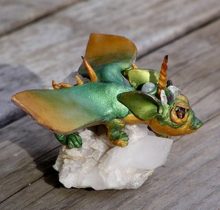
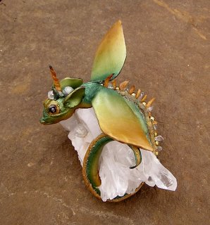
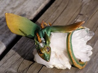
Been trying to get organized with the pictures to tell how I made Bri'th, who now lives on Mary's library office desk, defending her Cascading Style Sheet documents. She was created from about 2pm to 10pm on New Year's Eve, and slightly overbaked (I fell asleep) from midnight till three. Gave her to Mary the next afternoon.

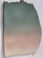
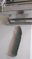
First I made a Skinner blend of metallic green, gold, and translucent. Then I reduced it in width by a process I invented, shown below with a different blend I just made this afternoon.


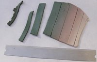
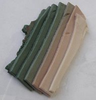
Take a blended sheet that is too wide from one solid-color edge to the other. Cut it into strips, with narrow ones at the edge. Keeping them in order, overlap them so that they form a sheet either two or three times thicker. Run it through the pasta machine a few more times to blend the strips, and you have a long narrow blend rather than a short wide one.

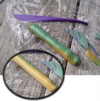
Wrapping two lengths of this around a short fat log so that I had a green spine and pale belly, I reduced and lengthened the log. This created a nice organic body piece shaded from a dark green back to gold sides and a paler belly. It even sort of had a spinal stripe from where the mica-shifted metallics were disturbed at the fusion. However, that got covered up by the spinal embellishments. I used half of the log for Bri'th; pictured below is the other half, plus a few other scraps of clay, and the tool I found most useful.


I pinched and shaped the head end of the log, then rolled and rolled to get the tail stretched out skinny and long enough to wrap around the quartz. A little tricky to keep it from twisting. I formed the body posture first, and did the face and decorations afterward, as Christi Friesen recommends. NOT the proper procedure when doing a statue like this wrapped around a hunk of heavy quartz. I should have done the head and wings, and the spine decorations, and then shaped her around the quartz.


The wings are cut from just the green/gold section of the blend, folded in half and then cut to get two identical symmetric wings. Best chill the clay beforehand, so you can get the two pieces apart again. The eyes are smoky quartz, the head and spine have quartz chips, and an orb of aventurine is at the base of the skull.

Sticking on the embellishments is a fiddly little job with fingers four times too big. I need some tweezers tipped with little chunks of makeup sponge, or some such. After getting a decoration to more-or-less stick, I would use the end of the tool to mess around with the clay at its base and kind of push it and blend it in.